
- February 28, 2024
- Posted by: Sudharchanan Vinayagam
- Category: Streamlit
Introduction
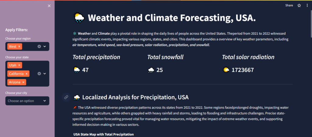
The ever-changing weather patterns and climatic events witnessed in the United States between 2021 and 2022 underscore the dynamic nature of our environment. From the bustling cities to the serene countryside, these phenomena left an indelible mark, prompting a closer examination of their impacts. In this blog post, we delve into the intricate world of weather and climate forecasting, leveraging advanced visualizations to unravel the key insights derived from the data.
Data Summarization
Our journey begins with the amalgamation of data from two distinct sources – the Global Weather & Climate Data for BI obtained from the Snowflake data marketplace and the Superstore dataset from Tableau’s default dataset. Leveraging the power of Python and the snowflake.connector module, we established a connection with the Snowflake data source, allowing us to query the HISTORY_DAY table and extract pertinent information. Subsequently, the extracted data was stored as a CSV file as upd_forecast_data.csv. For the second source is the Superstore dataset, the Region, State, and City columns were extracted individually. These columns were then merged with the Snowflake queried dataset, resulting in the consolidated dataset stored as upd_forecast_data.csv, laying the foundation for our analysis.
Code Snippet:
### python

# importing required modules
import streamlit as st
import snowflake.connector as sf

# Authentication with Snowflake credentials
conn=sf.connect(user='sudharchanan',password='Sudharcha$434',role='ACCOUNTADMIN',account='rw21158.central-india.azure',warehouse='COMPUTE_WH',database='global_weather__climate_data_for_bi')

# Create a cursor object
cur = conn.cursor()
st.session_state['snow_conn'] = cur

# Store the session returned data
@st.cache_data
def get_data():
    qry_historic = 'SELECT TOP 300000 * FROM global_weather__climate_data_for_bi.standard_tile.history_day;'
    st.session_state['snow_conn'].execute(qry_historic)
    res = st.session_state['snow_conn'].fetch_pandas_all()
    return res

# function call for snowflake extracted data from get_data()
data = get_data()

# store the data as CSV
data.to_csv('upd_forecast_data.csv', index=False)
Air Temperature Variations
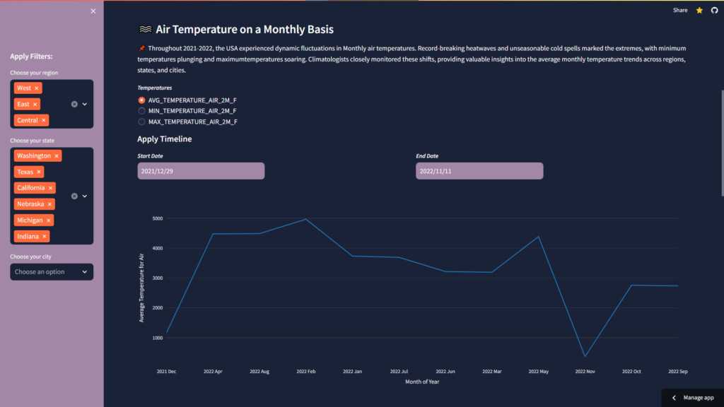
The fluctuations in air temperature across the USA during the aforementioned period were nothing short of remarkable. From sweltering heatwaves to bone-chilling cold spells, our Line Chart paints a vivid picture of these extremes. With a focus on minimum, maximum, and average monthly temperatures, we unravel the nuanced patterns that underpin these variations, offering valuable insights into temperature trends over time.
Key Performance Indicators:
- Minimum Temperature: Represented by the lower variations of air temperature.
- Maximum Temperature: Represented by the higher variations of air temperature.
- Average Temperature: Represented by the mean variations of air temperature.
Precipitation Patterns By State
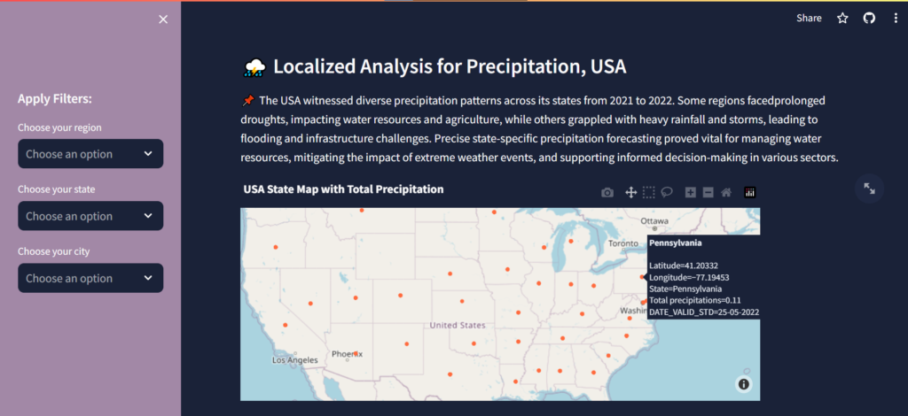
The precipitation patterns observed across different states of the USA presented a tapestry of diversity. While some regions grappled with prolonged droughts, others were inundated with heavy rainfall and storms. An USA Map Chart provides a visual representation of state-wise precipitation levels, aiding in understanding the geographical distribution of precipitation events.
Key Performance Indicators:
- Precipitation Intensity: Displayed through colour gradients on the Map.
- State-Specific Precipitation Levels: Hover over each state for detailed information.
Wind Speed Variance by Region
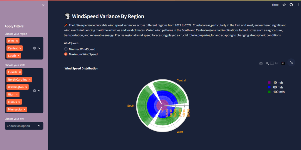
The variance in wind speed across various regions – East, West, South, and Center – had far-reaching implications for various sectors, including maritime activities, agriculture, and transportation. Our Wind Rose Chart offers a comprehensive depiction of these variations, capturing the frequency and intensity of wind events in each region.
Key Performance Indicators:
- Dominant Wind Directions: Represented by region sectors in the chart.
- Wind Speed Distribution: Displayed through segment lengths with wind speed.
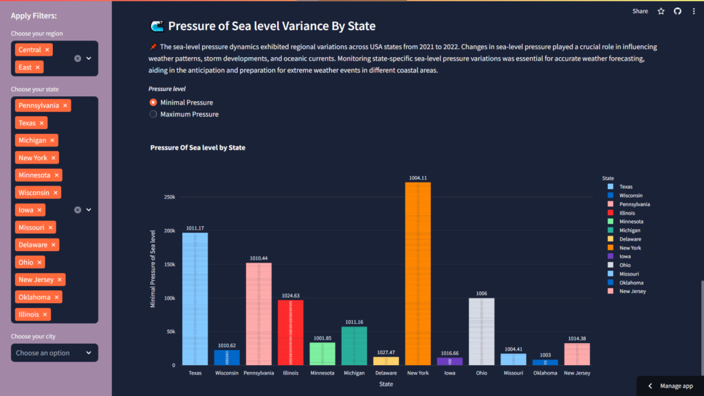
Sea-Level Pressure Variations by State
Sea-level pressure variations emerged as a key determinant of weather patterns and storm developments across different states of the USA. Through our Bar Chart, users can visualize these variations, gaining a comparative view of atmospheric conditions and aiding in the forecasting of extreme weather events.
Key Performance Indicators:
- State-Specific Sea-Level Pressure: Displayed as vertical bars in the chart.
Conclusion
In conclusion, the period from 2021 to 2022 bore witness to a myriad of climatic events in the USA, each leaving its unique imprint on the landscape. Through the lens of advanced visualizations such as Line Charts, Geo-Maps, Wind Rose Charts, and Bar Charts, we embarked on a journey to unravel the mysteries of weather and climate forecasting. Armed with valuable insights, our findings serve as a compass for climate scientists, policymakers, and the public, empowering them to navigate the complexities of our ever-changing environment.
Explore Further
To delve deeper into our insights and visualizations, visit the website at Weather and Climate Forecasting for USA.
Cittabase is a select partner with Snowflake. Please feel free to get in touch with us regarding your Streamlit solution needs. Our Streamlit solutions encompass a range of services and tools designed to streamline your data visualization, quick prototyping, and dashboard development processes.