
- May 30, 2024
- Posted by: Deva Dharshini R, Sudharchanan Vinayagam
- Category: APEX
Introduction
Oracle Application Express (APEX) provides a robust framework for building web applications with ease. One of its powerful features is the integration of Chart.js, a popular JavaScript library for creating dynamic and interactive charts. In this exploration, we delve into the realm of dynamic chart attribute settings, leveraging the capabilities of Chart.js within Oracle APEX.
Dynamic chart attributes allow developers to customize the appearance and behaviour of charts based on various parameters. This exploration focuses on how to dynamically configure chart attributes such as margin, title, colour, font size, and more. By harnessing the flexibility of Chart.js, we can create charts that adapt to changing data and user preferences.
Throughout this journey, we’ll navigate the intricacies of Oracle APEX, uncovering techniques to fetch and apply dynamic attribute settings to our charts.
Creating Components for Chart Attributes
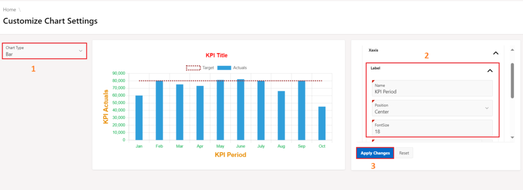
- Create a blank page, then create three region Chart Type, Chart Display, and Attribute Settings.
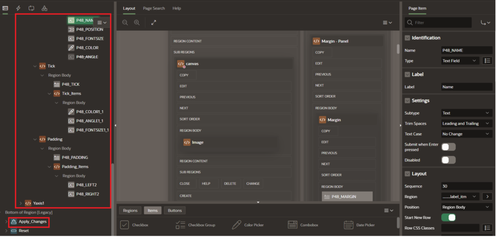
- Under attribute settings regions, create three sub-regions namely Margin, Label, Ticks which contains page items for chart attributes.
- Under each sub regions namely like Margin [ Left, Right, Top, Bottom ], Label for X-axis and Y-axis [ Name, Front Size ], Ticks for X-axis and Y-axis [ Font Size, Color ].
- Create a button named Apply Changes to display the modifications in the chart based on the provided value.
Loading Chart.js Chart On-Page-Load
- Go to the chat attributes settings page, click on page Title, and on the Right pane, choose JavaScript-> Execute When Page loads.
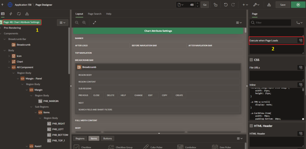
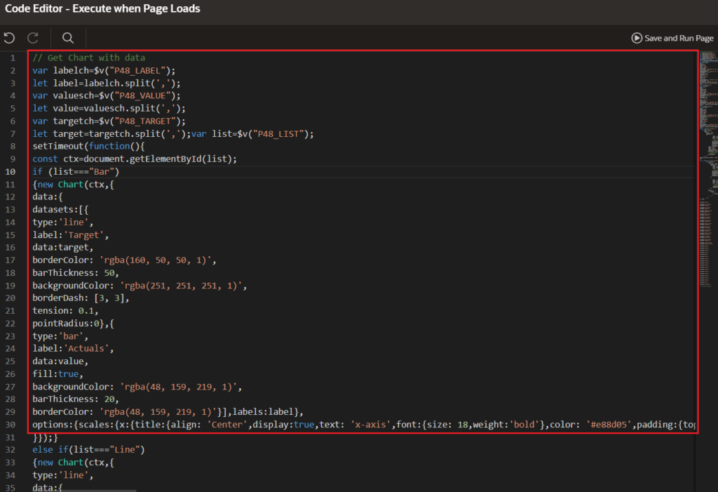
- Use the following code to an Execute When Page Loads section for loading a default Chart.js chart with its data on page load, use the JavaScript code mentioned below.
Code:
var labelch = $v("P48_LABEL");
let label = labelch.split(',');
var valuesch = $v("P48_VALUE");
let value = valuesch.split(',');
var targetch = $v("P48_TARGET");
let target = targetch.split(',');
var list = $v("P48_LIST");
setTimeout(function() {
    const ctx = document.getElementById(list);
    if (list === "Bar") {
        new Chart(ctx, {
                data: {
                    datasets: [{
                        type: 'line',
                        label: 'Target',
                        data: target,
                        borderColor: 'rgba(160, 50, 50, 1)',
                        barThickness: 50,
                        backgroundColor: 'rgba(251, 251, 251, 1)',
                        borderDash: [3, 3],
                        tension: 0.1,
                        pointRadius: 0
                    }, {
                        type: 'bar',
                        label: 'Actuals',
                        data: value,
                        fill: true,
                        backgroundColor: 'rgba(48, 159, 219, 1)',
                        barThickness: 20,
                        borderColor: 'rgba(48, 159, 219, 1)'
                    }],
                    labels: label
                },
                options: {
                    scales: {
                        x: {
                            title: {
                                align: 'center',
                                display: true,
                                text: 'KPI Period',
                                font: {
                                    size: 18,
                                    weight: 'bold'
                                },
                                color: '#e88d05',
                                padding: {
                                    top: 5,
                                    bottom: 5
                                }
                            },
                            ticks: {
                                minRotation: 0,
                                maxRotation: 0,
                                font: {
                                    size: 12
                                },
                                color: '#07ac46'
                            },
                            grid: {
                                display: true
                            }
                        },
                        y: {
                            title: {
                                display: true,
                                text: 'KPI Actuals',
                                font: {
                                    size: 18,
                                    weight: 'bold'
                                },
                                color: '#e88d05'
                            },
                            ticks: {
                                minRotation: 0,
                                maxRotation: 0,
                                font: {
                                    size: 12
                                },
                                color: '#07ac46'
                            },
                            grid: {
                                display: true
                            }
                        }
                    },
                    layout: {
                        padding: {
                            left: 10,
                            right: 10,
                            top: 10,
                            bottom: 10)
                    }
                },
                plugins: {
                    title: {
                        align: 'center',
                        display: true,
                        text: 'KPI Title',
                        font: {
                            size: 16,
                            weight: 'bold'
                        },
                        color: 'red'
                    },
                    legend: {
                        display: true
                    }
                }
            }
        });
}
}, 200);Note: The code above illustrates a Bar chart. To create a Line, Area, or Scatter chart, you can simply add an “else if” condition to check the chart name against a list variable containing the available chart types.
Create a Dynamic Action for Chart Updating
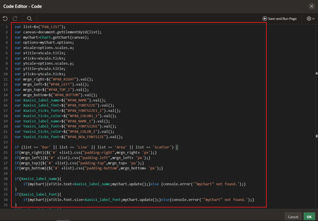
- A variable of the list represents page item [P48_LIST] of drop-down which includes Chart Types such as Bar, Line, Area, Scatter
- A variable of canvas contains the current value of the page item [P48_LIST] to rendering the chart.
- A variable of myChart represents Chart Instance of Chart.js which is used to Initialize a new chart instance using the appropriate chart type (e.g., line chart, bar chart, area chart) and provide the canvas context.
- A variable of options represents the Configuration and Customization part of Chart.js charts. By utilizing elements of Chart.js Options are Axis Title [name,font-size, color], Axis Ticks [font-size, color, angle], Chart Layout [chart_title, chart_color], chart_margin], etc.
- The variables of xTitle, yTitle, xTicks, yTicks, margin_left, margin_right, margin_top, margin_bottom are attributes which is used to customize X-axis and Y-axis values and change margin layout of chart.
- The values that you get on run-time for variables of Xaxis1_label_name, Xaxis1_label_font, Xaxis1_ticks_font, Xaxis1_ticks_color, Yaxis1_label_name, Yaxis1_label_font, Yaxis1_ticks_color, Yaxis1_ticks_font.
Code:

var list = $v("P48_LIST");
var canvas = document.getElementById(list);
var myChart = Chart.getChart(canvas);
var options = myChart.options;
var xScale = options.scales.x;
var xTitle = xScale.title;
var xTicks = xScale.ticks;
var yScale = options.scales.y;
var yTitle = yScale.title;
var yTicks = yScale.ticks;
var mrgn_right = $("#P48_RIGHT").val();
var mrgn_left = $("#P48_LEFT").val();
var mrgn_top = $("#P48_TOP_1").val();
var mrgn_bottom = $("#P48_BOTTOM").val();
var Xaxis1_label_name = $("#P48_NAME").val();
var Xaxis1_label_font = $("#P48_FONTSIZE").val();
var Xaxis1_ticks_font = $("#P48_FONTSIZE1_1").val();
var Xaxis1_ticks_color = $("#P48_COLOR1_1").val();
var Yaxis1_label_name = $("#P48_NAME_1").val();
var Yaxis1_label_font = $("#P48_FONTSIZEE").val();
var Yaxis1_ticks_color = $("#P48_COLOR_1").val();
var Yaxis1_ticks_font = $("#P48_NEW_FONTSIZE").val();
if (list == 'Bar' || list == 'Line' || list == 'Area' || list == 'Scatter') {
    if (mrgn_right) {
        $('#' + list).css("padding-right", mrgn_right + 'px');
    }
    if (mrgn_left) {
        $('#' + list).css("padding-left", mrgn_left + 'px');
    }
    if (mrgn_top) {
        $('#' + list).css("padding-top", mrgn_top + 'px');
    }
    if (mrgn_bottom) {
        $('#' + list).css("padding-bottom", mrgn_bottom + 'px');
    }

    if (Xaxis1_label_name) {
        if (myChart) {
            xTitle.text = Xaxis1_label_name;
            myChart.update();
        } else {
            console.error('"myChart" not found.');
        }
    }
    if (Xaxis1_label_font) {
        if (myChart) {
            xTitle.font.size = Xaxis1_label_font;
            myChart.update();
        } else {
            console.error('"myChart" not found.');
        }
    }
    if (Xaxis1_ticks_font) {
        if (myChart) {
            xTicks.font.size = Xaxis1_ticks_font;
            myChart.update();
        } else {
            console.error('"myChart" not found.');
        }
    }
    if (Xaxis1_ticks_color) {
        if (myChart) {
            xTicks.color = Xaxis1_ticks_color;
            myChart.update();
        } else {
            console.error('"myChart" not found.');
        }
    }
    if (Yaxis1_label_name) {
        if (myChart) {
            yTitle.text = Yaxis1_label_name;
            myChart.update();
        } else {
            console.error('"myChart" not found.');
        }
    }
    if (Yaxis1_label_font) {
        if (myChart) {
            yTitle.font.size = Yaxis1_label_font;
            myChart.update();
        } else {
            console.error('"myChart" not found.');
        }
    }
    if (Yaxis1_ticks_font) {
        if (myChart) {
            yTicks.font.size = Yaxis1_ticks_font;
            myChart.update();
        } else {
            console.error('"myChart" not found.');
        }
    }
    if (Yaxis1_ticks_color) {
        if (myChart) {
            yTicks.color = Yaxis1_ticks_color;
            myChart.update();
        } else {
            console.error('"myChart" not found.');
        }
    }
}
Now, Save and Run the application and then you’ll find Dynamic Chart Attribute Settings as Shown below
Conclusion
This code snippet demonstrates the versatility and capability of Oracle APEX when paired with Chart.js for dynamic charting. Developers can effortlessly customize and expand this code to suit particular needs within their APEX applications.
By utilizing the synergy between APEX and Chart.js, users can generate visually engaging and interactive charts that improve the data visualization aspects of their web applications. Play around with the code, adjust the settings, and explore the extensive possibilities of dynamic charting in Oracle APEX.
Feel free to incorporate this data retrieval mechanism into your Oracle APEX applications to enhance the dynamic charting experience for your users.