
- March 5, 2024
- Posted by: Angel Maria
- Category: APEX
Dynamic Charting in Oracle APEX Using Chart.js
Introduction
Oracle APEX (Application Express) is a powerful low-code development platform for building web applications on the Oracle Database. One common requirement in business applications is the need to visualize data through charts. Oracle APEX chart creations has a limitation to pre-define the chart type and the number of charts in a dashboard page.
Dynamic charting is a feature to dynamically determine the number of charts to create on a dashboard page, chart types and chart attributes. This can be done based on the data setup done for the chart type and attributes in the backend for the dashboard page. In this blog, We will create dynamic charts for a KPI dashboard based on the chart type and the attributes stored for different KPI in the backend.
In this blog post, we will integrate Oracle APEX with Chart.js, a popular JavaScript library for creating interactive and dynamic charts.
Step 1 : Create a table to store the chart details of different KPI.
| CREATE TABLE “TB_SC_KPI_DETAILS” ( “ID” NUMBER NOT NULL ENABLE, “KPI_CODE” VARCHAR2(100) NOT NULL ENABLE, “KPI” VARCHAR2(200) NOT NULL ENABLE, “YTD” VARCHAR2(50) NOT NULL ENABLE, “FREQUENCY” VARCHAR2(200) NOT NULL ENABLE, “PERIOD_TYPE” VARCHAR2(200) NOT NULL ENABLE, “WEIGHT” VARCHAR2(200) NOT NULL ENABLE, “MEASURE” VARCHAR2(200) NOT NULL ENABLE, “BASELINE” NUMBER NOT NULL ENABLE, “TARGET” NUMBER NOT NULL ENABLE, “MIN” NUMBER NOT NULL ENABLE, “MAX” NUMBER NOT NULL ENABLE, “OPTIMIZATION” VARCHAR2(200) NOT NULL ENABLE, “CHART_TYPE” VARCHAR2(200) NOT NULL ENABLE, “CREATED_BY” NUMBER NOT NULL ENABLE, “CREATED_DATE” DATE NOT NULL ENABLE, “LAST_UPDATED_BY” NUMBER, “LAST_UPDATED_DATE” DATE, “DELETE_FLAG” VARCHAR2(1) NOT NULL ENABLE, “OBJECTIVE_ID” NUMBER NOT NULL ENABLE, “PERSPECTIVE_ID” NUMBER NOT NULL ENABLE, “SCORECARD_DETAILS_ID” NUMBER NOT NULL ENABLE, “SCORECARD_ID” NUMBER NOT NULL ENABLE, CONSTRAINT “TB_SC_KPI_DETAILS_PK” PRIMARY KEY (“ID”) USING INDEX ENABLE ) ; |
Step 2 : Create a blank apex page to display the KPI Charts.
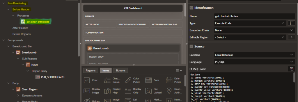
Step 3 : Create a pre-render header process to retrieve the attributes of the chart from the table.
Retrieving and Storing Data for Dynamic Charting
To enhance the dynamic charting capabilities in Oracle APEX using Chart.js, we can extend our understanding by incorporating data retrieval and storage. The following PL/SQL code retrieves relevant data from the database and stores it in APEX page items for later use in the dynamic chart creation process.
This PL/SQL block fetches data related to perspectives, KPI details, and chart attributes from the database, processes it, and stores the relevant information in APEX page items. This data will later be utilized by the dynamic charting code, ensuring that the charts reflect the most up-to-date information from the underlying database tables.
| declare lv_label varchar2(10000); lv_margin varchar2(10000); lv_attr_name varchar2(1000); lv_attr_key varchar2(10000); lv_xyattr_key varchar2(10000); lv_xyattr_value varchar2(10000); lv_value varchar2(10000); lv_target varchar2(10000); lv_kpi varchar2(10000); lv_chart_type varchar2(10000); lv_chart varchar2(10000); begin –Get the label, value, target, KPI and chart_type for k in ( select distinct kd.id id, kd.kpi kpi, kd.chart_type chart_type from TB_SC_KPI_DETAILS kd, VW_KPI_ACTUALS_MONTHLY_SCORE vw, TB_SC_BUSINESS_GOALS_OBJECTIVES o, TB_SC_PERSPECTIVES p, tb_sc_scorecard sc where kd.chart_type in (‘Bar’,’Pie’) and vw.actual_month <> ‘-‘ and kd.id = vw.id and kd.OBJECTIVE_ID = o.id and kd.perspective_id = p.id and kd.scorecard_id = sc.id and kd.delete_flag = ‘N’ and p.delete_flag = ‘N’ and o.delete_flag = ‘N’ and sc.delete_flag = ‘N’ and to_char(kd.perspective_id) = nvl(j.id, -1) order by kd.kpi ) loop for i in ( select vw.ACTUAL_MONTH label, vw.id, sum(vw.ACTUALS) actuals, vw.target target from VW_KPI_ACTUALS_MONTHLY_SCORE vw where upper(vw.KPI) = UPPER(k.kpi) and k.chart_type in (‘Bar’, ‘Pie’) and vw.id = k.id and vw.actual_month <> ‘-‘ group by vw.ACTUAL_MONTH, vw.target, vw.id ) loop lv_label := lv_label || i.label || ‘,’; lv_value := lv_value || i.actuals || ‘,’; lv_target := lv_target || i.target || ‘,’; end loop; lv_label := rtrim(lv_label, ‘,’) || ‘nextkpi’; lv_value := rtrim(lv_value, ‘,’) || ‘nextkpi’; lv_target := rtrim(lv_target, ‘,’) || ‘nextkpi’; lv_kpi := lv_kpi || regexp_replace(k.kpi || ‘-id-‘ || k.id, ‘\s’, ‘_’) || ‘,’; lv_chart_type := lv_chart_type || k.chart_type || ‘,’; end loop; —get the attribute key for i in ( select char_type, attr_key, attr_value from TB_SC_CHART_ATTRIBUTES where attr_name = ‘margin’ and char_type in (‘Bar’, ‘Pie’) order by char_type ) loop lv_attr_key := lv_attr_key || i.char_type || ‘-‘ || i.attr_key || ‘,’; lv_margin := lv_margin || i.attr_value || ‘,’; end loop; –get the x-attribute key and x-attribute value for i in ( select attr_name, attr_key, attr_value from TB_SC_CHART_ATTRIBUTES where char_type = ‘Bar’ and attr_name not in (‘margin’, ‘padding’) and component in (‘xaxis1’, ‘yaxis1’) order by attr_name ) loop lv_xyattr_key := lv_xyattr_key || i.attr_name || ‘-‘ || i.attr_key || ‘,’; lv_xyattr_value := lv_xyattr_value || i.attr_value || ‘,’; end loop; :p44_label := lv_label; :p44_value := lv_value; :p44_target := lv_target; :P44_KPI := lv_kpi; :p44_chart_type := lv_chart_type; :P44_MARGIN := rtrim(lv_margin); :P44_ATTR_KEY := rtrim(lv_attr_key); :P44_XATTR_KEY := rtrim(lv_xyattr_key, ‘,’); :P44_XATTR_VALUE := rtrim(lv_xyattr_value, ‘,’); end; |
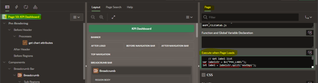
Step 2 : Place the below JavaScript code in the “Execute when page loads” Page attribute.
JavaScript for generating chart based on the Page item values
The code leverages various attributes and parameters to customize the appearance and behavior of different chart types.
| // Get label list var labelstr = $v(“P44_LABEL”); let label = labelstr.split(‘nextkpi’); // Get actual list var valuestr = $v(“P44_VALUE”); let value = valuestr.split(‘nextkpi’); // Get target list var targetstr = $v(“P44_TARGET”); let target = targetstr.split(‘nextkpi’); // Get kpi list var kpistr = $v(“P44_KPI”); let kpi = kpistr.split(“,”); // Get chart type list var charttypestr = $v(“P44_CHART_TYPE”); let charttype = charttypestr.split(“,”); var margin = $v(“P44_MARGIN”); let mrg = margin.split(‘,’); var attr_key = $v(“P44_ATTR_KEY”); let key = attr_key.split(‘,’); var xattr_value = $v(“P44_XATTR_VALUE”); let xvalue = xattr_value.split(‘,’); //alert(mrg); for (let i = 0; i < kpi.length; i++) { let lab = label[i].split(‘,’); let val = value[i].split(‘,’); let tgt = target[i].split(‘,’); setTimeout(function() { var ctx = document.getElementById(kpi[i]); if (charttype[i] === “Bar”) { new Chart(ctx, { data: { datasets: [ { type: ‘line’, label: ‘Target’, data: tgt, borderColor: ‘rgba(253, 58, 87, 0.75)’, backgroundColor: ‘rgba(253, 58, 87, 0.2)’, }, { type: ‘bar’, label: ‘Actuals’, data: val, fill: true, backgroundColor: ‘rgba(108, 217, 224, 0.75)’, borderColor: ‘rgba(75, 192, 192, 1)’ }], labels: lab }, options: { scales: { x: { title: { display: true, text: xvalue[6], font: { align: xvalue[7], size: xvalue[4], color: xvalue[3], padding: {top: xvalue[8], bottom: xvalue[5]} } }, ticks: { color: xvalue[2], font: { size: xvalue[0], angle: xvalue[1] } }}, y: {title: { display: true, text: xvalue[15], font: { size: xvalue[12], color: xvalue[13], align: xvalue[14] //, } }, ticks: { color: xvalue[9], font: { size: xvalue[11], angle: xvalue[10] } } ,beginAtZero: true }}} }); for (let j = 0; j < key.length; j++) { if (key[j]==’Bar-padding-top’) { $(“#”+kpi[i]).css(“padding-top”,mrg[j]+ ‘px’); } else if (key[j]==’Bar-padding-right’) { $(“#”+kpi[i]).css(“padding-right”,mrg[j]+ ‘px’); } else if (key[j]==’Bar-padding-left’) { $(“#”+kpi[i]).css(“padding-left”,mrg[j]+ ‘px’); } else if (key[j]==’Bar-padding-bottom’) { $(“#”+kpi[i]).css(“padding-bottom”,mrg[j]+ ‘px’); } } //alert(mrg[0]); } // Assuming “Pie” else if (charttype[i] === “Pie”) { new Chart(ctx, { type: ‘pie’, data: { labels: lab, datasets: [{ label: ‘Data’, data: val, backgroundColor: [ ‘rgba(255, 99, 132, 0.2)’, ‘rgba(54, 162, 235, 0.2)’, ‘rgba(255, 206, 86, 0.2)’, ‘rgba(75, 192, 192, 0.2)’, ‘rgba(153, 102, 255, 0.2)’, ‘rgba(255, 159, 64, 0.2)’ // Add more colors as needed ], borderColor: [ ‘rgba(255, 99, 132, 1)’, ‘rgba(54, 162, 235, 1)’, ‘rgba(255, 206, 86, 1)’, ‘rgba(75, 192, 192, 1)’, ‘rgba(153, 102, 255, 1)’, ‘rgba(255, 159, 64, 1)’ // Add more colors as needed ], borderWidth: 1 }] }, options: { aspectRatio: 2, // Adjust the aspect ratio as needed maintainAspectRatio: true, // Set to false if you want to allow the chart to } }); } }, 200); } |
Let’s break down the code and understand its key components.
Code Overview
The provided code is JavaScript embedded in an Oracle APEX application. It utilizes Chart.js to create charts dynamically based on the data provided through APEX page items. Here’s a brief overview of the code:
Data Retrieval:
The code extracts label, actual, target, KPI, chart type, margin, attribute key, and X-axis, Y-axis attribute value from APEX page items.
Chart Generation Loop:
The code then iterates over each KPI and generates a chart dynamically.
The chart type, labels, actual values, and target values are used to configure the Chart.js options.
Customization:
Additional customization is applied based on the chart type and provided attributes.
For example, padding is adjusted for bar and line charts, and specific options are set for area and scatter charts.
Chart Type Handling:
The code supports various chart types, including Bar and Pie. You can create other charts by enhancing the code for other chart types.
Each chart type is handled separately with its own configuration.
Dynamic Styling:
Styling attributes like colors, borders, and aspect ratio are set dynamically for each chart.
Step 3 : Create a Dynamic content region to display the chart generated using JavaScript mentioned in the Step 2.
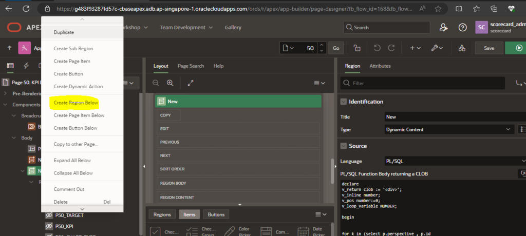
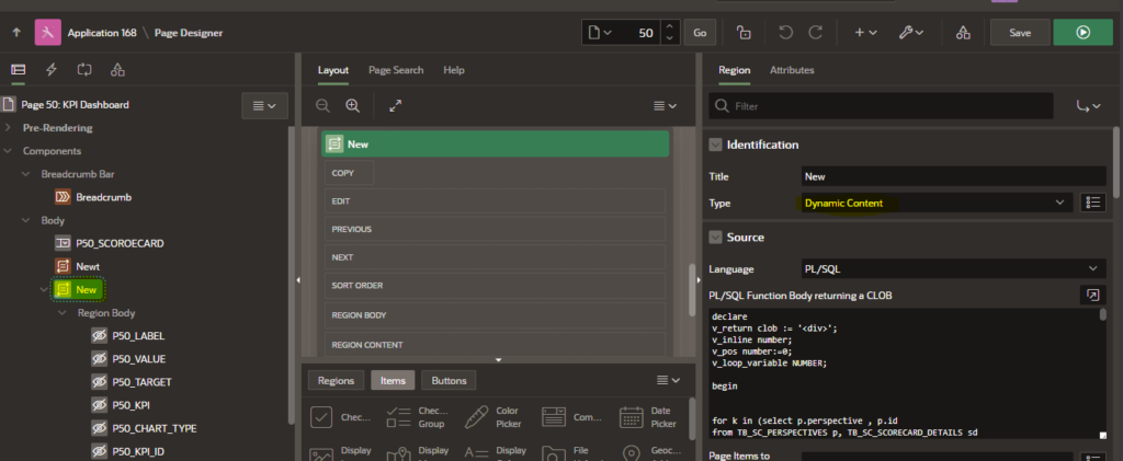
| declare v_return clob := ‘<div>’; v_inline number; v_pos number:=0; v_loop_variable NUMBER; begin htp.p(‘<div style =”text-align: center;” class=”row”>’); for i in (select distinct regexp_replace(kd.kpi||’-id-‘||kd.id,’\s’,’_’)kpi , kd.kpi kpi_name, kd.id kpi_id,kd.chart_type,kd.delete_flag kd_delete_flag, pin.PIN_FLAG pin_flag, pin.DELETE_FLAG Delete_flag from TB_SC_KPI_DETAILS kd left outer join (SELECT kpi_id,PIN_FLAG, DELETE_FLAG FROM TB_SC_PIN_CHART_TO_HOMEPAGE )pin on pin.kpi_id=id inner join VW_KPI_ACTUALS_MONTHLY_SCORE vw on kd.id=vw.id inner join TB_SC_BUSINESS_GOALS_OBJECTIVES o on kd.OBJECTIVE_ID=o.id inner join TB_SC_PERSPECTIVES p on kd.perspective_id= p.id inner join tb_sc_scorecard sc on kd.scorecard_id = sc.id where kd.chart_type in (‘Bar’,’Line’,’Area’,’Line with Area’,’Pie’,’Doughnut’,’Scatter’,’Gauge’) and vw.actual_month<>’-‘ and kd.delete_flag = ‘N’ and p.delete_flag = ‘N’ and o.delete_flag = ‘N’ and sc.delete_flag = ‘N’ and to_char(kd.perspective_id)=nvl(k.id,-1) order by 1) loop htp.p( ‘<div class=”col col-6 apex-col-auto”>’); htp.p(apex_string.format (‘<h4>’ || i.kpi_name ||’ <link rel=”stylesheet” href=”https://cdn.jsdelivr.net/npm/bootstrap-icons@1.7.2/font/bootstrap-icons.css”> </h4>’,i.kpi_id)); htp.p( ‘<canvas id=’ || i.kpi || ‘> </canvas>’); htp.p( ‘</div>’); end loop; htp.p( ‘</div>’); — close the row end loop; htp.p(‘</div>’); — close the tab htp.p(‘</div>’); — close the tabs container return v_return; end; |
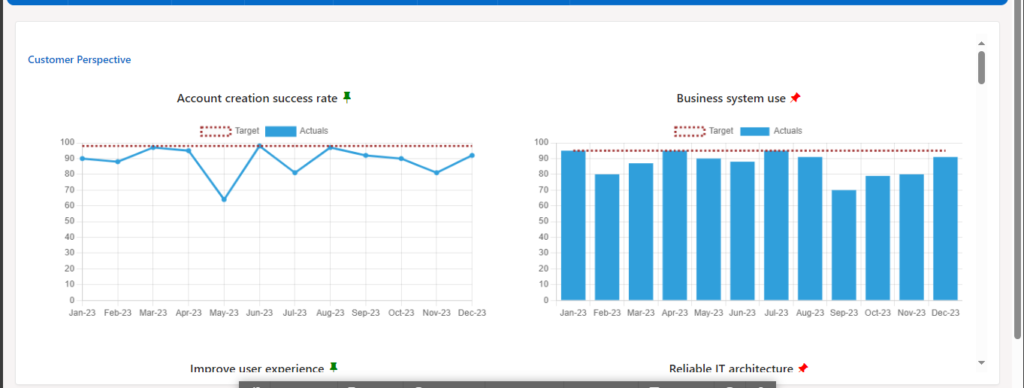
Step 4 : Run the existing page. The chart will be generated based on the data from the respective table.
Conclusion
This code snippet exemplifies the flexibility and power of Oracle APEX combined with Chart.js for dynamic charting. Developers can easily adapt and extend this code to meet specific requirements within their APEX applications.
By leveraging the integration between APEX and Chart.js, users can create visually appealing and interactive charts that enhance the data presentation capabilities of their web applications. Experiment with the code, tweak the parameters, and discover the full potential of dynamic charting in Oracle APEX.
Feel free to incorporate this data retrieval mechanism into your Oracle APEX applications to enhance the dynamic charting experience for your users.