
- January 12, 2020
- Posted by: Radhakrishnan N
- Category: Tableau
Curved Line Chart is one of the most widespread data visualization types. It looks very similar to the Line Chart type of data visualization. The core difference between them is that data points in a Curved Line Charts relate to smooth curves instead of straight lines. Curved Line Chart usually display the change of a variable over time.
To Create a Curved line Motion chart, first we need to create a curved line chart and then convert it into motion chart.
Curved Line Chart:
To Create a chart with Curved line data set must be in higher density, we can achieve this by below two ways.
- Show Missing Values:
If we have a dimension with missing values use the ‘Show Missing Values’ on the date dimension.
- Bin Based Measure:
If we have a dimension without any missing values, create a bin-based measure and use it as axis and then click ‘Show Missing Values’.
Python Integration:
Here we have used TabPy Server to get the lines curved.
TabPy is a new API that enables evaluation of Python code from within a Tableau workbook.
When we use TabPy with Tableau, you can define calculated fields in Python, thereby leveraging the power of many machine-learning libraries right from your visualizations.
First, we integrate TabPy to Tableau and create calculated measure and use it in the charts.
Install and connect to TabPy Server:
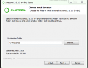
Install Anaconda:

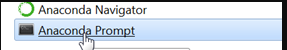
Run Anaconda Prompt After Installation complete.
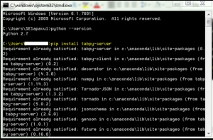
Install TabPy using Anaconda Prompt:
Command: pip install tabpy-server
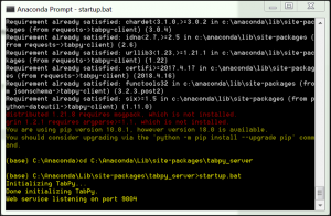
Start TabPy Server:
Run startup.bat
Open Tableau Desktop-Manage External Service Connection
Go to Help >Manage External Service Connection
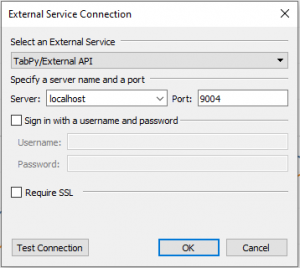
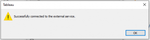
Click Test Connection.
Create calculation field with Python script as follows:
SCRIPT_REAL(‘
import scipy.interpolate as interpolate
X_all=_arg1
y_all=_arg2
y=[i for i in y_all if i is not None]
X=[i[0] for i in enumerate(X_all) if i[1] is not None]
Xsmooth=list(range(0,len(X_all)))
ysmooth=interpolate.pchip_interpolate(X,y,Xsmooth)
result=[round(i,10) for i in ysmooth]
return result
‘, attr([Date]),ATTR([Value1]))
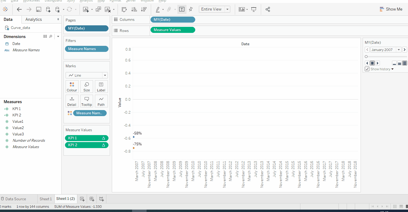
Curved Line Chart:
Refer the below gif to create curved Line chart.
Curved Line Motion Chart:
Add Date Field to Page area and change it to month formatting.
Change Marks to Circle to get better Visibility.
Below is the final output of the Curved line Motion chart.
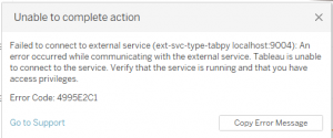
We have to make sure that the TabPy External service is running,so that we can get the curved lines in the chart,If the External Service is not running means we got the below error
With the above steps, you can create a Curved Line Motion Chart. Please feel free to reach gotableau@sandbox.cittabase.com for more information.
And also visit our Tableau Public site.